OTT
What Makes a Good OTT User Experience? Key Elements to Consider
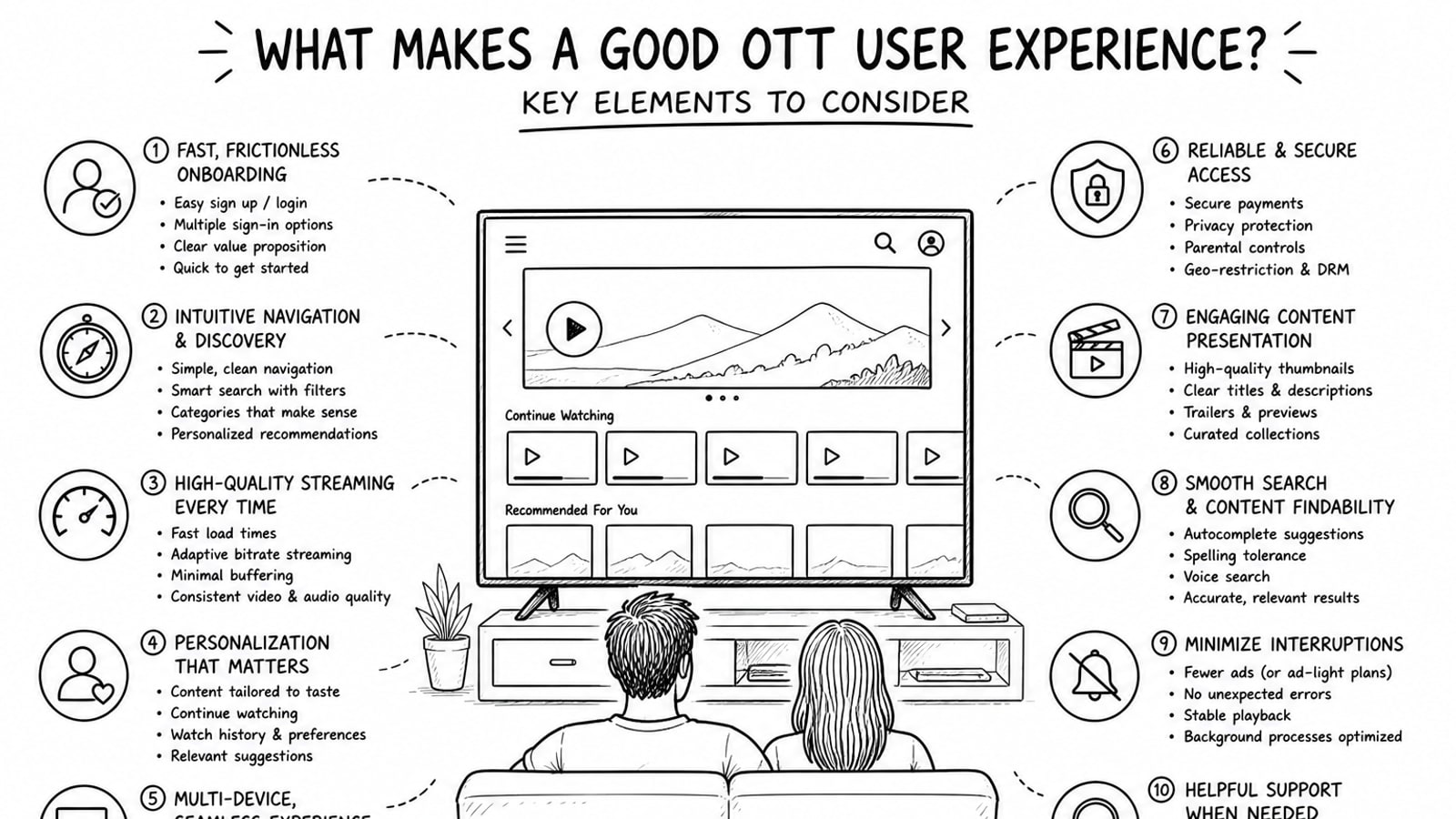
OTT user experience is the overall feeling viewers get when they browse, play, manage, and return to a streaming service. A good OTT experience makes content easy to find, playback easy to control, and subscriptions easy to understand across mobile, web, TV, and connected devices.
Quick Answer
A good OTT user experience combines clear navigation, fast playback, strong search, reliable performance, accessible controls, and consistent behavior across devices. It should help viewers move from opening the app to finding content and starting playback with as little friction as possible.
Key Takeaways
Viewers judge OTT UX quickly, usually by how easily they can find something worth watching.
Playback reliability matters as much as interface design. A beautiful app still fails if buffering, crashes, or confusing controls get in the way.
TV-first design is different from mobile design because users sit farther away, read larger text, and rely on remotes rather than touch.
Accessibility features such as captions, transcripts, and readable controls improve the experience for more than just accessibility users.
A flexible backend and media delivery setup can improve both user experience and operating efficiency.
Why OTT User Experience Matters
OTT platforms compete in crowded markets where users can switch services in seconds. That makes user experience a business issue, not just a design issue. If discovery is hard, onboarding is confusing, or video playback feels unreliable, viewers are less likely to stay engaged.
Good UX helps users feel in control. They know where to click, how to continue watching, how to manage subscriptions, and how to trust the platform on every device they use.
Core Elements of a Good OTT User Experience
1. Simple content discovery
Users should be able to find something relevant fast. That means clear categories, helpful recommendation rows, visible continue-watching areas, and search that handles titles, genres, actors, and common spelling mistakes.
The best OTT services reduce browsing fatigue. Instead of overwhelming users with endless carousels, they make each row meaningful and explain why a recommendation appears.
2. Fast, predictable navigation
Navigation should feel obvious on every screen. On TV apps, focus states must be clear because users rely on remote controls, not touch. On mobile and web, buttons, tabs, and filters should be easy to scan and large enough to use without hesitation.
A good rule is that users should always know three things: where they are, what they can do next, and how to go back.
3. Smooth video playback
Playback is the heart of OTT UX. Startup time should be short, controls should be responsive, and quality changes should feel seamless. Users expect resume playback, subtitle controls, audio options, and reliable scrubbing without the player breaking the experience.
Even strong content can lose value if the player feels unstable. In practice, this means adaptive streaming, well-handled buffering states, and media controls that work the same way on the major platforms your audience uses.
4. Clear onboarding and account flow
Account creation, sign-in, and subscription steps should feel lightweight. Too many forms, unclear pricing, or repeated authentication requests create early drop-off. The more devices a service supports, the more important it is to keep account linking and sign-in consistent.
For family or multi-profile services, profile creation and profile switching should also be quick and easy to understand.
5. Personalization that helps instead of distracts
Personalization should improve relevance, not create clutter. Useful personalization includes continue watching, language preferences, watchlists, recently viewed content, and recommendations based on real behavior. It should support discovery without making users feel trapped inside one narrow content lane.
6. Accessibility as a default
A strong OTT experience includes captions, readable text, keyboard or remote-friendly controls, and players that support accessibility. Accessibility is not a separate feature set. It is part of whether the product is usable at all.
It also improves usability in everyday situations, such as watching in a noisy room, navigating from across the living room, or switching between devices with different screen sizes.
7. Cross-device consistency
Users often start on one device and continue on another. A good OTT platform keeps watch history, preferences, subscriptions, and playback progress synchronized. The interface does not need to look identical everywhere, but the logic should feel familiar.
This consistency is especially important when moving between mobile, web, smart TV, Android TV, Apple TV, and other connected TV environments.
8. Trustworthy subscription and billing UX
Users should understand what they are paying for, what trial terms apply, and how to cancel or change plans. Hidden conditions and confusing billing pages damage trust quickly. In OTT, trust is part of the experience because subscription decisions often happen inside the app.
9. Performance behind the scenes
Users do not see the architecture, but they feel its effects immediately. Page speed, player startup time, image delivery, CDN behavior, and media hosting decisions all shape the product experience. Good OTT UX depends on strong delivery infrastructure as much as strong screen design.
How OTT UX Changes on TV Devices
TV UX deserves special treatment because it is not just a large mobile app. People sit farther from the screen, use remotes, and browse in shorter bursts before deciding what to watch. Text must be bigger, focus indicators must be obvious, and navigation paths must avoid unnecessary steps.
That is why OTT teams should test their product in real living-room conditions instead of only in browser previews or desktop simulators.
A Practical OTT UX Review Framework
Discovery: Can a new user find something relevant in under a minute?
Navigation: Is every major action reachable with clear back behavior and visible focus states?
Playback: Does video start quickly and recover gracefully when bandwidth changes?
Accessibility: Are captions, readable controls, and accessible media options available by default?
Continuity: Does progress sync cleanly between mobile, web, and TV?
Trust: Are pricing, subscription terms, and account actions easy to understand?
Common Mistakes That Hurt OTT User Experience
Treating TV UX exactly like mobile UX.
Hiding search or making content categories too broad to be useful.
Overloading home screens with too many rows and too little context.
Making subscription and sign-in flows harder than the content browsing flow.
Ignoring captions, text readability, and remote-focused navigation.
Separating product design decisions from playback and delivery infrastructure.
Where Bitbyte3 Can Fit
For teams building or upgrading an OTT platform, the delivery model behind the experience matters. Bitbyte3 offers OTT solutions that can support a more flexible operating setup, including a BYOA model, short for Bring Your Own Account.
In this model, each client can use its own infrastructure account, such as Cloudflare Stream for video and image delivery, instead of being limited by shared platform storage or bundled usage restrictions. Depending on the project, that can give teams more direct control over media costs, storage behavior, and account ownership while still improving the front-end experience users see.
That matters because a strong OTT UX is not just about interface polish. It is also about whether the underlying system can deliver fast, stable, scalable playback without adding unnecessary operational friction.
Methodology and Editorial Note
This article focuses on UX principles that consistently matter across OTT and connected TV products: discovery, navigation, playback, accessibility, continuity, and trust. It also considers official platform guidance for TV interfaces and accessibility best practices for media experiences.
Product-specific details about Bitbyte3 were included only from the information provided in the brief and were phrased conservatively to avoid unsupported claims.
FAQ
What is OTT user experience?
OTT user experience is how people interact with a streaming service from content discovery to playback, account management, and return visits across devices.
Why is OTT UX different from regular app UX?
OTT UX often has to work across smart TVs, remote controls, mobile devices, and web browsers. That creates different navigation, readability, and playback expectations than a standard mobile-first app.
What is the most important part of OTT UX?
Playback reliability and content discovery are usually the two biggest factors. If users cannot find something relevant or the video experience feels unstable, the rest of the design matters less.
How do captions and accessibility improve OTT UX?
They make the platform more usable for people with hearing, vision, or navigation needs, and they also help everyday users in noisy environments, shared spaces, or across device types.
What does BYOA mean in an OTT solution?
BYOA means Bring Your Own Account. In the context shared for Bitbyte3, it means clients can use their own service accounts for media delivery rather than relying only on shared pooled infrastructure.
How can a company improve OTT UX without rebuilding everything?
Start with UX audits around discovery, navigation, playback, and account flow. Many OTT improvements come from reducing friction in those core journeys rather than redesigning every screen at once.
Sources and Further Reading
Android Developers: TV app quality - https://developer.android.com/docs/quality-guidelines/tv-app-quality
Android Developers: Best practices to drive engagement on Google TV - https://developer.android.com/training/tv/get-started/google-tv?hl=en
W3C Web Accessibility Initiative: Making Audio and Video Media Accessible - https://www.w3.org/WAI/media/av/
Apple Developer Documentation: Focus and selection - https://developer.apple.com/design/human-interface-guidelines/focus-and-selection
Conclusion
A good OTT user experience makes streaming feel effortless. Viewers can discover content quickly, trust the platform, control playback easily, and continue watching across devices without confusion.
If you are evaluating or building an OTT product, start by fixing the moments where users hesitate: search, navigation, playback, accessibility, and subscription flow. Those are usually the points that separate a service people try once from one they keep using.
Teams exploring a more flexible OTT stack can also review solutions from Bitbyte3 at https://bitbyte3.com/ to see whether its delivery model fits their product and cost requirements.
About the Author
R. Jabar
Marketing Strategist
R. Jabar is a marketing strategist who helps streaming and OTT brands turn complex product stories into clear, growth-driven messaging. She writes about audience acquisition, content monetization, and the marketing frameworks that help video platforms scale.
More from the blog
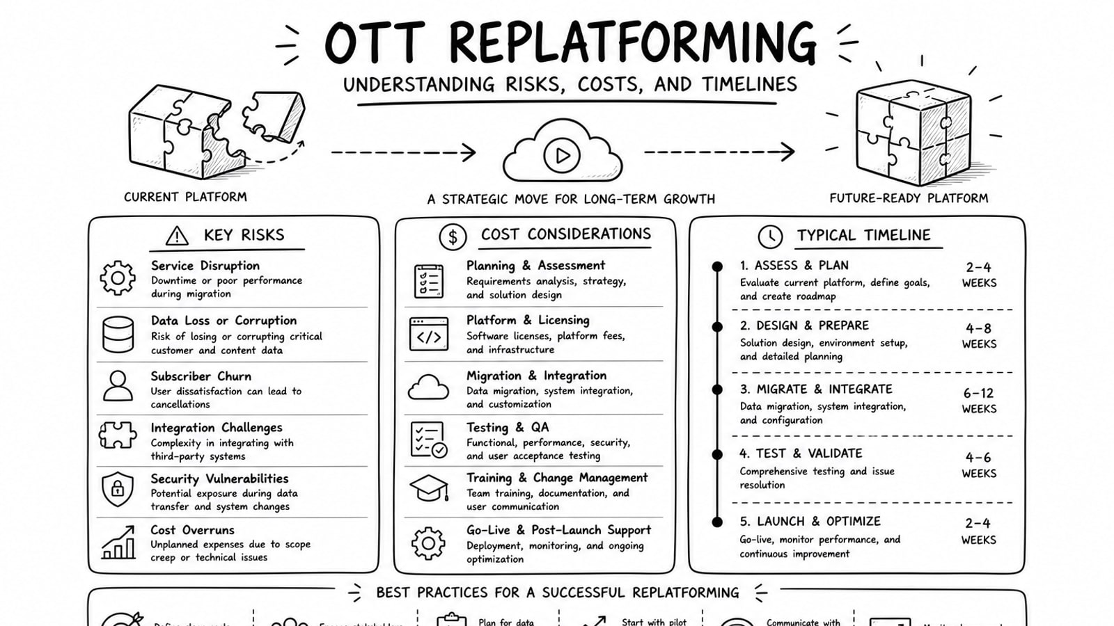
OTT Replatforming: Understanding Risks, Costs, and Timelines
A practical guide to OTT replatforming that explains why teams migrate, what usually drives risk and cost, how long projects tend to take, and where a BYOA delivery model can reduce lock-in.
Read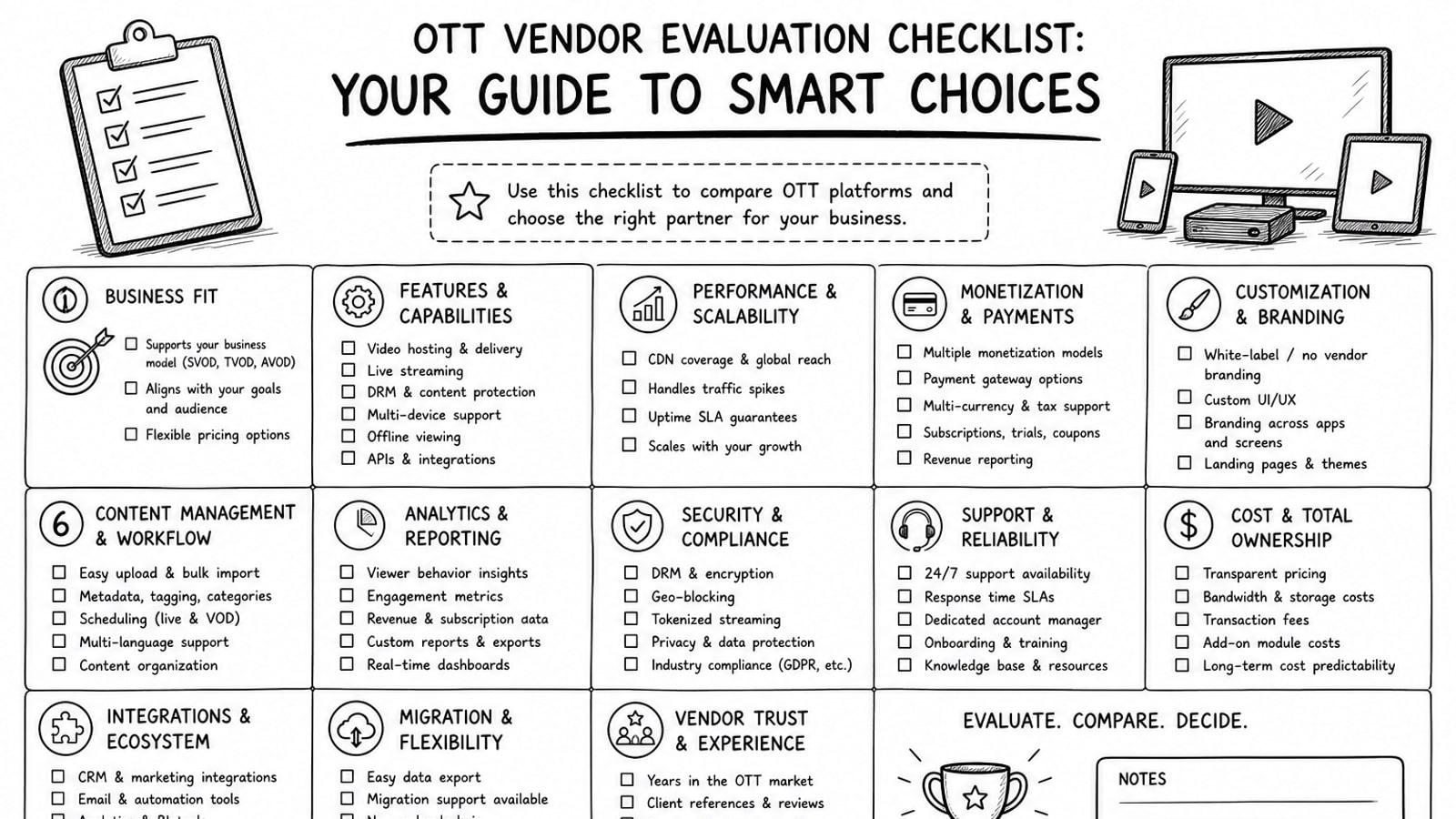
OTT Vendor Evaluation Checklist: Your Guide to Smart Choices
A practical guide to evaluating OTT vendors, with a clear checklist for delivery, security, workflow, cost, ownership, and long-term platform fit.
Read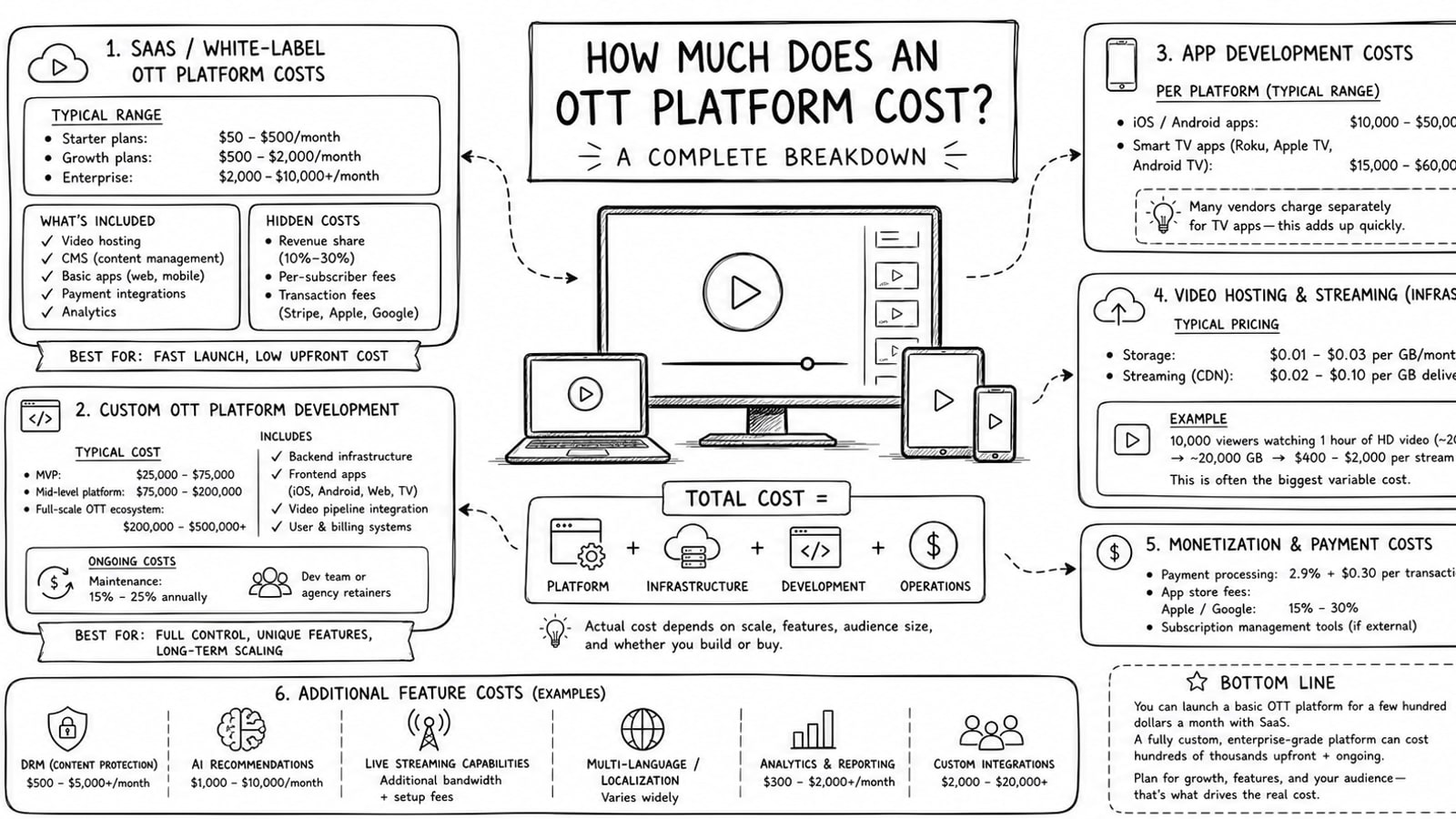
How Much Does an OTT Platform Cost? A Complete Breakdown
A practical breakdown of OTT platform costs, including launch expenses, recurring infrastructure costs, live and on-demand pricing examples, and how a BYOA model can improve cost control.
Read